Sunday 17 January 2016

ANIMATION PRODUCTION EVALUATION/SWOT


EVALUATION
This module was called Animation Production; which required making a 15 second animation based around the theme of ‘circles’. To start off, I created a brainstorm for the theme of circles and came up with multiple ideas for my images, after a process of elimination I decided to use my strongest idea to take forward, after a very short development I decided to change my idea to my weakest idea, I wanted to expand my style and techniques. The idea was a chase through a forest. I then created rough thumbnails and storyboards. I started to look into multiple artists’ style, work and the process of how they’re created to help get a sense of how I would create mine. Creating mood boards to collect their images and show the common elements in all their work to realise what they use/do, to get their style; which gives them their own persona and recognition. With my refined ideas I developed them by tracing over the assets individually in Illustrator, using a graphics tablet makes it much faster and the line work is a lot smoother. ­After developing multiple trees, two characters and some other assets for the background I inverted the colours, with the designs being created in Illustrator, the artwork will be vectors instead of bitmaps, and this allowed me to change the colours a lot quicker by selecting the whole image and simply changing the colours with the pallet, I created an alpha channel to allows the background to be clear when it was imported into Cinema 4D, with help from my tutor I created the basics of my animation the sk­y, floor camera movement and path for the camera to follow. Bit by bit I added the assets such as the trees in the background to cover the horizon, one the trees and assets were placed I then added the two characters, the last one being animated.
From the start and throughout the project my strengths were always my artwork skills, as well as my digital skills using programmes such as Photoshop and Illustrator. I was very confident with this project even though my knowledge of Cinema 4D was very little, I knew I would need a lot of assistance from my tutors and that was a huge comfort as it helped me to learn more about Cinema 4D quickly. What I would improve on is probably making sure I know how something can be done before making that part of my plan/idea.
I used InDesign to write my annotation for my digital work, I noticed several spelling errors were made when I printed my work out. The reason is that spellcheck is a manual option in InDesign therefore I was unaware of any spelling errors due to not being notified on the screen. I completely take the blame as I should have read my work before printing. The work looks unprofessional and also quite embarrassing therefore I will correct the mistakes and re-print the work.
Setting myself targets is a great way to help be prepared and to make sure I don’t encounter the same mistakes, my main target that I’m setting myself is to be more aware of time management and be sure each piece is finished before moving onto something else, overall I enjoyed this project a lot, being good and interesting in animation defiantly helped as well and I am looking forward to the next animation project, as well as the next illustration as the many artists I have looked at, didn’t inspire me much as this project was based on animations but I have a much wider range of styles and techniques to use in the next project.

SWOT ANALYSIS

S - Strengths;

W - Weaknesses;

O - Opportunities;

T - Threats; 

Saturday 16 January 2016

PRACTICE ENRICHMENT FINAL


This is my final illustration for life drawing, after 5 weeks of  progress this is my outcome.


PRACTICE ENRICHMENT DEVELOPMENT


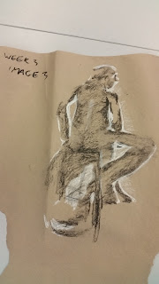
This is the progress of all my illustrations produced from life drawing.

WEEK 1:


WEEK 2:


WEEK 3:


WEEK 4:


WEEK 5:


Thursday 14 January 2016

SPELLING ERRORS


 Fixing mistakes that could improve your marks is a priority. 

I used InDesign to write my annotation for my digital work, I noticed several spelling errors were made when I printed my work out. The reason is that spellcheck is a manual option in InDesign therefore I was unaware of any spelling errors due to not being notified on the screen. I completely take the blame as I should have read my work before printing. The work looks unprofessional  and also quite embarrassing therefore I will correct the mistakes and re-print the work.

Monday 11 January 2016

SETTING TARGETS


SETTING TARGETS

ANIMATION PRODUCTION

Throughout this project I have been very calm and at ease, my time keeping management has dramatically improved since the previous projects, but I still have strengths and weaknesses that I need to solve/work out.

STRENGTHS: 

Artwork; the main focus of this project is the assets and completing them in time to be able to place them in Cinema 4D, from the start of the project my focus has been on the detail and quality of my assets.

Research; because of my previous course, the method and way research is produced in this course, I already have knowledge of what to research and what is a waste of time. Usually I go out of the briefs requirements and research independent work because I am confident that I can finish it within my tim plan I tend to have a lot of written work.

WEAKNESSES:

Sketches; out of all the projects, my amount of sketches have been minimal, mainly because I have worked digitally throughout my development. But with the previous project the majority of my work was sketches so I am gradually improving with the amount of drafts and sketches I produce.

Animations; my most important weakness that is improving with each project is my skills with software such as Cinema 4D and After Effects, I always prefer to have assistance with my tutor when producing my animations and hopefully after this project I will feel just as confident with the programs when I'm working individually.


STORMTROOPER ILLUSTRATION


STORMTROOPER

During this project I have spent my own time creating illustrations that are different to my art style. I decided to illustrate a stormtrooper right after watching The Force Awakens, using Illustrator and the pen tool to create the multiple layers for the shading and light that is reflecting off the helmet. I was told to look at an artist on Instagram by my tutor; Hydro74, and I love his work, after starting this illustration just to pass time i'm genuinely interested into expanding my art style and learn how to illustrate digitally with this technique and style.


Sunday 3 January 2016

ARTIST RESEARCH - Mode 2


ARTIST RESEARCH

MODE 2


I love not only the 3 examples I have chosen but Mode 2 himself, his artwork and graffiti is great, I’m attracted and drawn to his work because of the street art he produces. I chose 3 different illustrations that have different elements or use different techniques, for example; the first image looks to be drawn traditionally with pencil and the background painted, I think there is a little bit of digital editing but I like the use of mixed media. The other 2 have a tone of colour and house style which makes then look professional, personally.

Compared to my work, ideas and designs Mode 2 does interest me as my first idea was to have the illustrations created in graffiti and street art style. So his artwork does inspire my current work.

ARTIST RESEARCH - Kozy N Dan


ARTIST RESEARCH

KOZY N DAN


Kozy N Dan is probably one of my favourite artists, his work, style and ideas are great and his artwork has inspired a lot of my previous illustrations. The 3 images I chose as examples are my favourite of his work. The landscape designs have a tone of detail, especially in the linework, which was the main inspiration from my previous and current project. Throughout my ideas my main focus has been detail in the linework and not as much in the colour.


The skull illustration caught my attention because of how bold it was. Big, bright colours and lots of rabbits! But I was more interested in the technique and how the detail was applied. Kozy N Dan has started to become one of my favourites due to him amazing artwork. Throughout this project I have used a lot of his work as reference, some for his attention to detail and others to help understand when there is too much going on in a single design.

ARTIST RESEARCH - Ashley Wood


ARTIST RESEARCH

ASHLEY WOOD


I love Ashley Wood’s artwork and especially the 3 examples I chose. The one that stood out the most was defiantly the Star Wars painting, purely because I’m a huge Star Wars fan so I was directly drawn to it. The detail and just raw style is exquisite, it really makes me want to expand and develop my art style and learn more techniques. Each painting seems to have a story behind it, mostly involving war and danger but the style of using the same elements in each painting.

Again I think these are excellent pieces of artwork but the style and technique doesn’t interest me in this project.

ARTIST RESEARCH - Amy Sol


ARTIST RESEARCH

AMY SOL


I love these 3 illustrations created by Amy Sol! They usually aren’t my style but they did they grab my attention, I find the method and techniques used to create these inspiring, using wood as a canvas to paint on is a superb idea, a lot different to what I’m used to, either drawing on paper or digitally. But this helps to expand my knowledge with what instruments you can use when creating an illustration or piece of art.

For my animation development, this artist didn’t really inspire my ideas, as much as I like her work it just isn’t my art style therefore I won’t be taking elements of Amy Sol’s work and incorporating them in my own work.


The reason I chose these 3 specifically is because they have a lot of depth, within the detail of the painting and within the fore, mid and background. My favourite parts of these would probably be the contrast between the main focus and the backgrounds; which consist of much darker bolder tones that stand out and emphasise the main aspect, the light pastel colours.

ARTIST RESEARCH - Alex Pardee


ARTIST RESEARCH

ALEX PARDEE


I chose these 3 illustrations created by Alex Pardee because not only did they grab my attention but I can relate to these much more than his other pieces of work, my favourite example would be the batman illustration, only it’s a frail, withered portrait of the character. The reason I love this so much is because it was my main focus and inspiration to help improve my art style, I was referred to Alex Pardee because of his abstract, weird and street art like style, similar to what I was looking for.


The skull illustration caught my attention because of how bold it was. Big, bright colours! But I was more interested in the technique and how the colour was applied. Again, Alex Pardee has started to become one of my favourites due to him insane artwork. 

Throughout this project I have used a lot of his work as reference, some for his attention to detail and others to help understand when there is too much going on in a single design.

PRACTICE ENRICHMENT


PRACTICE ENRICHMENT

LIFE DRAWING

For practice enrichment I had to take part in life drawing with my class, each week we would experiment with many medias including pencil, ink, charcoal and chalk. Not only using different instruments but learning about techniques; composition, light and shadow.


Personally I didn't enjoy the life drawing itself but i learned a lot of techniques and ways to experiment with while drawing. The reasons i didn't enjoy it is because of the confined space and drawing while in a uncomfortable position, i found it hard to get engaged and really commit to the illustrations.

Overall I thought it was a good experience and i have learned quite a few techniques in the process.