Monday, 28 March 2016

PERSONAL RESEARCH/REFERENCE - MORTAL KOMBAT X

INITIAL RESEARCH/REFERENCE
MORTAL KOMBAT X


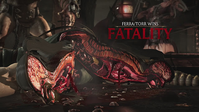
Lately, my idea has been going through constant changes and adjustments and I have created a rough Photoshop design of what the final outcome may look like; a big part of the illustration is the gore between the two sides of the face and surrounding the skull. therefore I decided to use one of my favourite games as reference, the many ways to see inside of a body and how they look from multiple angles is a great use to this design. Simply playing and looking at the animations of the anatomy being shown brutally and being dismembered created a excellent visualisation of my finished design and how to illustrate the gore elements. I prefer using this source as reference and inspiration compared to a stock image from the Internet.   

Sunday, 27 March 2016

PERSONAL RESEARCH - PAUL JACKSON

INITIAL RESEARCH
PAUL JACKSON

I started to look at Paul Jackson's work very early in this project, when I was still creating multiple ideas; his work was my source of inspiration when refining my lycanthropy themed idea. I found his work more relatable compared to other artists that used paint or media what wasn't allowed within the brief. What I like about his work would be the attention to detail and how even the smallest of elements are illustrated perfectly. Throughout his artwork he uses a mixture of rendering techniques; from dotwork, cross hatching to just using strokes. All of his artwork only consists of shades of black; this was the main reason I didn't want to use colour in my final illustration also because my confidence and skill of coloured illustrations aren't as good as grayscale.


These images became my main focus, inspiration and reference material once I created an idea that I wanted to refine and develop, my designs heavily involved animals and their own skulls so using how he represents the two elements was a huge help as I found myself stuck and confused throughout the beginning of this project.

Involving gore and the anatomy was an idea that I thought of with the help of my tutor; this would be a excellent way to piece the two different elements together, the skull and the head. My only problem was to think of a successful way to use the gore part; with my style being mainly comic art it wasn't hard to come up with a rough sketch of a wolf covered in gore, my only concern was should the illustrations be realistic or in the style of comic art? This question is still a major concern therefore i'm trying out multiple ways to show both styles within the same illustration.

PERSONAL RESEARCH - KERBY ROSANES

INITIAL RESEARCH
KERBY ROSANES

I first saw Kerby Rosanes work while researching and looking for reference imagery, unfortunately I couldn't find out who created this art until I came across his illustrations on Instagram. What I was so attracted to his artwork is his 'Geometric Beasts' series, a group of illustrations consisting of multiple animals where one half of the animal will be drawn using geometric shapes. This really caught my attention, such small simple designs that consist of both realistic and imaginative/abstract artwork.


After understanding his process, methods and researching this artist in much more depth I started to try adn incorporate this style in some of my sketches, unfortunately they didn't seem to fit the current them at that time; they seemed like random illustrations therefore they weren't included in my sketchbook ideas and concepts. But knowing the process by practising means I could try and use this style in some of my later development to help refine the design or include more than one theme.

PERSONAL RESEARCH - NYCHOS

INITIAL RESEARCH
NYCHOS

As soon as my chosen idea was created as well as my theme, the first artist that I thought of that could be used as both excellent reference material and inspiration is work created by Nychos. An illustrator, character designer and graffiti artist that uses themes such as x-rays, skeletons and translucent all within his artwork, whether it's traditionally hand drawn or spray painted. With having my idea being very similar to his style it was obvious to use his work as a starting point to help visually create a structured plan of my design.


These were my initial inspiration, as I couldn't decide on the media I wanted to use so I stuck to his traditional illustrations as they would help me the most. With my idea of using animals, especially a wolf, finding a piece of artwork that he created that consisted of the same or similar animals increased my confidence of creating a successful illustration as I thought there could be too many elements in my design.

After experimenting with media and developing my sketches I have decided to use coloured pencils in my illustration, this will create more depth within the design and having a variety of colours could help to separate or identify the elements. I will continue to use Nychos work as a guide adn reference throughout the rest of this project alongside other artists that provide their own specific style or technique that I could learn and replicate. 

Monday, 21 March 2016

CURRENT UPDATE - SKETCHES/IDEAS


 After a week of this project I have designed multiple ideas to then be refined and developed into my final illustration, all of these ideas are based around multiple themes that has changed throughout the development of these ideas. USing the process of elimination I have narrowed my design down to one idea that I believe is the strongest and what I personally think will be the most fun to illustrate.

I have tried to use a range of styles, from abstract, realistic and comic art to broaden my horizon and create multiple designs all of which have their individual elements. The themes that i have covered are 'Samurai, Anatomy and Lycanthropy', all of which are related to both the brief and the illustrations

To develop my chosen illustration which is the last image, the human skeleton adn the side view of a wolf, I will experiment with multiple media that are within the briefs requirements adn try using charcoal and coloured pencils.


Sunday, 6 March 2016

YR 1 ASSESSMENT WEEK 2, TASK 1 DIGITAL SKILLS - PANDA PANTHER

ARTIST RESEARCH

Panda Panther


The last practitioner that I am researching and analysing the work they produce is Panda Panther, the first example is an animation created for Zune and the concept of the animation is based on a spartan style war, the title of this animation is called 'Masks'. This animation is created using different methods, designing and modeling a battleground and then creating the 3D models for each character and placing the animation onto the recorded footage of the environment. What I like about this animation is not only the 3D and handmade props but the designs and concept of the two characters, the art style of this animation is very similar to the several examples of Panda Panther's work, I really like this house style and how the same techniques and process are used throughout multiple projects.
As far as the story goes, I'm not sure why this was created, I couldn't understand the plot of the message within the animation but enjoyed to watch it and analysis the production and process.


The second example of Panda Panther's work is an animation for Hello Kitty, the plot and story is shown on the website so it was easy to follow as I didn't have to re-watch the animation to try and understand it because of the very random and unexplained encounters that happen throughout. "Traveling through mysterious forests and sunny beaches she discovers new hidden treasures. Kitty’s secret house is revealed through sharing magic experiences. By sharing her own secret house, she brings her friends closer to each other." Reading this first the animation made a lot more sense about what was happening. But I am still unaware of the purpose of this animation and why it was made, nothing was being advertised or shown to give the impression it was promoting anything.

The art style is very peculiar and isn't like any animation of Hello KItty that I have seen, it consists of multiple medias such as both 2D and 3D, live action footage and mixed media across the background elements. Overall I didn't like this animation, I thought it was pointless and it seemed like their wasn't a plan or concept and that multiple ideas and elements were just placed into the animation. 


"PandaPanther set sails for the high skies and journeyed through twisting tornadoes alongside 
one-eyed-pirates and flying sheep to bring the latest cinematic installment to the Skylanders Franchise. We produced all the in game cut-scenes for Activision’s latest Nintendo 3DS release in stereoscopic 3D." This animation is the last example of Panda Panthers's work and it's an excellent piece of animation that is used as a commercial to advertise the latest Nintendo 3DS game for Skylanders. Knowing this information before watching it I understood the whole duration, as the animation doesn't give away any hints itself about the product, the story or who it is advertising, this description was an essential part of understanding this animation. 

The production process of this animation is way over my head, I couldnt think of what software could produce these individual elements adn the background but the atmosphere is constantly changing throughout the animationchanging from a bright, happy environment to a dusky, stormy and corrupt environment.

YR 1 ASSESSMENT WEEK 2, TASK 1 DIGITAL SKILLS - PUNGA

ARTIST RESEARCH

Punga


The first example of work created by Punga is an animation that was created for Fox Retro, very similar to another animation that I researched that was created for Fox Retro, they both seems to consist of the same house style and concept. This specific animation that Punga created is called 'Spaziaiii!' I am not sure what the animation is about, it doesn't tell your anything or explain what is being shown, they show astronauts playing games throughout space, with rockets, spaceships and racing. The animation itself looks wellmultiplel like their is not meaning and how it related to Fox Retro at all. I'm quite disappointed as I have no idea why or what the animation was trying to show.  Breaking down the production methods I'd say each individual element was created traditionally and then development into 3D model, using software such as Cinema 4D. The use of typography throughout the animation is great, it's bold, bright and readable. By creating an atmosphere and using lighting to create highlight and shadows really add extra detail to the models, it creates a more realistic feel with the environment changing constantly.


The second example of Punga'a work is an animation that was created for promote and advertise the British Red Cross, the animation shows multiple cartoon like bacteria having fun with hearts and organs, using them as slides, trampolines essentially making it humorous. The message that it is getting across is that don't waste your organs, donate them so they are able to be used properly to save lives instead of letting bacteria use them. The subject itself is quite touchy and could be personal to a lot of the audience by essentially making a funny animation about organ donation but this animation has done a great job to be punctual and state that the Red Cross are looking for organ donations but by making the advertisement joyful and funny.

The art style of the animation is very cartoon like with 3D models, I think a big aspect of the style is the artwork and models are using cel-shading to create that cartoon like appearance.  The colours consist of having the main elements such as the organs to b a bright pink colour while having the background  dull pastel like tone to contrast and almost illuminate the importance of the lungs, heart and other organs that are shown throughout this animation.


The final example of Punga's work is an animation called 'Criminal Minds' and is an animation that was created for Fox Crime to promote and advertise a TV programme that is being shown on the Fox channel. This animation is really interesting as the style is based around a subject that I am very interested in, inkblot and the Rorschach test. The animation shows images creates by ink to tell a message about the programme its advertising. The artwork is very impressive but I think that the camera angles, the background noise and static effects create the suspense and atmosphere throughout. The camera uses very sudden movements and jumps to different angles. Changing the ace throughout and creating a effect of unstableness with the help of the static effect it works well with the black and red ink that contrast against each other to highlight different elements of the illustrations.