Monday, 16 May 2016
Sunday, 15 May 2016
EVALUATION/SWOT - AIR MAX
EVALUATION - AIR MAX
This module was for the Air Max Day 2016; which required making a poster of 3D models and typefaces explaining or showing air max day; the software we used to create this was Cinema 4D. To start off, we were shown a list of posters that Nike released showing designs of trainers, using them as research and reference and choose 3 designs which appealed to me the most and then using each pair of trainers as a guide I created multiple ideas that were based around the 3 posters. Then developing the idea by picking font from DaFont and fracing over them altering them in my own way/style After a process of elimination I decided to use my strongest idea to take forward, creating my design based off the 'Brazil' poster, a green digital camouflage with a handful of bright colours to represent the amazon rainforest. Using Cinema 4D to create my 3D typeface, using the extrude to create the 3D elements and simple adding the created camouflage that was created using Photoshop and by applying a material it was very simple to add colour to the typeface.I then experimented with layout and the composition multiple times, altering the elements each time and getting a tutor to assess or comment on the work so that was a major help getting constant feedback as it significantly improved my design. My final design included a plugin that I was showed by my tutor, it was great learning about plugins and how they work and I think it improved my design significantly. Once the typeface was complete I then experimented with the camera and what angle should the camera be looking at, trying to make use of the 3D space as much as possible. My final designs consisted of 2 pieces, the second was the first design I created during a class tutorial at the start of the project, both design consist and show different methods that were used to create 3D text in Cinema 4D.
This module was for the Air Max Day 2016; which required making a poster of 3D models and typefaces explaining or showing air max day; the software we used to create this was Cinema 4D. To start off, we were shown a list of posters that Nike released showing designs of trainers, using them as research and reference and choose 3 designs which appealed to me the most and then using each pair of trainers as a guide I created multiple ideas that were based around the 3 posters. Then developing the idea by picking font from DaFont and fracing over them altering them in my own way/style After a process of elimination I decided to use my strongest idea to take forward, creating my design based off the 'Brazil' poster, a green digital camouflage with a handful of bright colours to represent the amazon rainforest. Using Cinema 4D to create my 3D typeface, using the extrude to create the 3D elements and simple adding the created camouflage that was created using Photoshop and by applying a material it was very simple to add colour to the typeface.I then experimented with layout and the composition multiple times, altering the elements each time and getting a tutor to assess or comment on the work so that was a major help getting constant feedback as it significantly improved my design. My final design included a plugin that I was showed by my tutor, it was great learning about plugins and how they work and I think it improved my design significantly. Once the typeface was complete I then experimented with the camera and what angle should the camera be looking at, trying to make use of the 3D space as much as possible. My final designs consisted of 2 pieces, the second was the first design I created during a class tutorial at the start of the project, both design consist and show different methods that were used to create 3D text in Cinema 4D.
I was very excited and confident with this project even though my skills with Cinema 4D weren't as good, I knew I would need a bit of assistance from my tutors when I had to add certain elements in Cinema 4D or when learning new skills and techniques.. What I would improve on is probably making sure don't get too driven by one project and try my best to focus on multiple projects as that was my main issue; being behind on my WBL project due to the time and effort I put in this air max design.
Setting myself targets throughout this project is an excellent way to keep track of my progress and make sure I am not behind my set schedule and also that I am making sure all of my work is correct. Overall I enjoyed this project thoroughly and would like to use Cinema 4D more often in future projects as I had much fun with this one. I hit several challenges along the way but with the help of tutors and classmates I successfully managed to finish this project without much problems or complications. The skills that I have learned within this project will help a lot in the next project using Cinema 4D, as well as using the software in personal work.
REFLECTION/UPDATE 15/05/16
REFLECTION/UPDATE
15/05/16
Since the last update on my work progress I have completed my PPD task, all of my blog posts are up to date and complete. The air max project is also complete and my final pieces have been mounted on A2 foamboard. The only project that is still unfinished is my Work Based Learning project therefore all of my attention and time is going towards it. Unfortunately I believe I am unable to complete my final piece on time for Monday at 4pm, I will discuss this with my tutor and let him know the reasons why I won't be able to hand in a finished design. Therefore I will have a little ore time to complete my written work and any development that hasn't been finished, I will double check and make sure everything is annotated. I am unfortunate that I won't have a finished final design due to timing and loosing 1 week of valuable time when attending the Pictoplasma Festival. On the brightside I am looking forward to the summer project.
Saturday, 14 May 2016
EVALUATION/SWOT - WBL
WORK BASED LEARNING - EVALUATION
This module was called Work Based Learning and was a competition for the Derwent Art Prize 2016; which required an illustration to be made only with specific media, which were;anything that was pencil, including water-soluble, pastel, graphite, charcoal or colouring pencils. The brief allowed the theme or concept of the illustration to be of your choosing, usually I struggle at first when I'm allowed 100% freedom because there is nothing to initially guide me through my ideas compared to making a simple/basic theme that can be manipulated. My designs and themes change and develop over time until I found what I wanted to illustrate.
This module was called Work Based Learning and was a competition for the Derwent Art Prize 2016; which required an illustration to be made only with specific media, which were;anything that was pencil, including water-soluble, pastel, graphite, charcoal or colouring pencils. The brief allowed the theme or concept of the illustration to be of your choosing, usually I struggle at first when I'm allowed 100% freedom because there is nothing to initially guide me through my ideas compared to making a simple/basic theme that can be manipulated. My designs and themes change and develop over time until I found what I wanted to illustrate.
To start off, I created a brainstorm for the
theme and came to the conclusion of having my character based around multiple ideas; samurai's, then skeletons and the anatomy, my final theme was a mixture of the anatomy and animals. After a process of elimination I decided to use my strongest idea to
take forward, an illustration of a wolf's head being torn apart into two pieces, and within is a human skull that starts to show.
With this project there wasn't much research or inspiration to use compared to the previous projects, sticking to 1 or 2 artists to use their style as a reference, I didn't want to involve too many artists as the illustrations and elements within might get a little to compact by replication or using multiple styles as ideas. Each theme or concept that was thought of; I sketched out several designs before altering or changing the current theme, after some time I had my chosen theme for my final illustration. Once I created a rough idea of what my design may look like using Photoshop I then experimented with the layout, and positioning of the elements and testing out different medias. The development part of this project wasn't as much as I thought, it consisted of multiple copies of my idea all with a different style, render technique, media or textures. But all of this helped me to create my final idea which was then illustrated on paper using Prismacolor pencils.
I was very confident with this project even though my preferred style is digital illustration, I knew I would need a bit of assistance from my tutors when thinking of a concept and that was a huge comfort when refining and developing my ideas. What I would improve on is probably making sure I stick to my chosen idea and make sure it is developed and pushed the furthest it can before starting to draw that idea.
Setting
myself targets and evaluating my work constantly is a great way to help be prepared and to make sure I don’t
encounter any major mistakes, my main target that I’m setting myself is to be
more aware of time management and be sure each piece is finished before moving
onto something else, but with being away in Berlin attending the Pictoplasma Festival I did lose a valuable week of work that would of helped greatly. Overall I enjoyed this project a lot, It was a change from producing digital illustrations and working on my traditional skills helped a lot. I am
very pleased with my outcome and the work that I have produced in this project, although I wish I was able to finish the project to my standards or at least complete a little more work but with the time I had left I am happy with the work I have produced there are a lot of skills and techniques that I have learned throughout and
will help me a lot in future projects that include traditional illustrations as well as the next project that will be completed during the holidays.
WBL TASK 1 - LITTLE CHIMP SOCIETY
LITTLE CHIMP SOCIETY
When researching and finding out what for LCS offer to artists and illustrators, I was welcomes to their homepage where I saw this illustrator; Mark Reihill. Without even looking through multiple artist, I was immediately attracted to his style and work. The example of Reihill's work that I will analyse and deconstruct is his 'Civil War' illustration. What attracted my attention was all of his illustrations are based off well know shows, movies, games etc. The ones I liked the most is his rogue One, Civil War, Negan, X-Men Apocalypse and The Notorious; and what all of these have in common is that they have recently been in the news or hyped about on social media. I love how his illustrations aren't something only he knows or can relate to. Having such a wide range of themes and concepts that are frequent and popular is an excellent way to get your name across but also to sell your artwork.
I absolutely love his style, these digital paintings that consist of a mixture of custom brushes, gradients and the pen tool all collaborate to create this wonderful illustration. Outlining each element with a white border helps to separate the 3 characters as well as to illuminate them as the white constant with the colour background allowing them to essentially 'pop out'. His painting seems to be a perfect mixture of precision and rough, capturing so much detail within the images yet having brush strokes go out of line or look messy and rushed.

The second artist that has collaborated or is featured on Little Chimp Society's website is Jake Parker, after looking through his work I realised I recognised most of it, turns out I have been following him on Instagram for quite some time. What I love about this illustrator is his wide range of products he creates; from illustrations to fan art, graphic novels to book covers and logos. The example of Jake Parker's work that I will evaluate is this illustration;
 There isn't a title of brief for this design, so i'm guessing this illustration was conceptual and not for commercial work. The reason I chose this is because it mostly reminded me of a game that I play a bit too much, Destiny. The illustration itself is really cool, the way the character the character is posing and his facial expression does reminds me of some graffiti style characters that I have seen. Usually I'm not a fan of cartoonish designs, sometimes I find them a bit plain but the abstract shape of the body and head change my perspective with this illustration. I think this was originally created traditionally with ink and then placed into digital software to then have the colour added, the reason for thinking this is because the tinwork is neat, there are uneven lines, some are messy which makes me believe it wouldn't have been done digitally due to the precision and how neat the lifework could be if it was created in Illustrator or Photoshop.
The last artist that is shown on The Little Chimp Society is Chris Hall; a freelance illustrator that uses both traditional and digital skills/methods within his work. I chose artists that produce different work from each theory, trying to broaden my horizon and knowledge and all these skills and methods of his to create and illustration whether its digital or traditional. Although I picked this artist to compare the the previous ones, I am not impressed as I was for the last 2, I just find that simple illustrations created digitally are more challenging to grab someones attention. Although I understand the concept and idea behind this piece; 'Get Outside And Play' I would most likely choose another illustration over this one, mainly because of the lack of detail and colour; although hat is the art style. But I personally prefer more details and line work.
 This was defiantly created digitally, using only solid colour and gradients is a excellent combination, I think the house style is constant and the colour scheme is a great choice as they don't been together so it is obvious what each element is. Overall I have enjoyed learning about these artist and not only how they create their illustration but comparing them and seeing the difference between the skills and methods used within each design.

The last artist that is shown on The Little Chimp Society is Chris Hall; a freelance illustrator that uses both traditional and digital skills/methods within his work. I chose artists that produce different work from each theory, trying to broaden my horizon and knowledge and all these skills and methods of his to create and illustration whether its digital or traditional. Although I picked this artist to compare the the previous ones, I am not impressed as I was for the last 2, I just find that simple illustrations created digitally are more challenging to grab someones attention. Although I understand the concept and idea behind this piece; 'Get Outside And Play' I would most likely choose another illustration over this one, mainly because of the lack of detail and colour; although hat is the art style. But I personally prefer more details and line work.

Friday, 13 May 2016
PICTOPLASMA - JULIAN GLANDER
PICTOPLASMA
JULIAN GLANDER
During my visit to the Pictoplasma Festival I attended a screening where Julian Glander showed and talked about his work. Which is a selection of 3D gifs, animations and illustrations. He is one of my favourite animators simply because of his design and the ideas behind them, at the screening he talked about how he would decide to create something for the fun or it and not knowing exactly what to do with the finished product of how it came to the final design. I find this not only very interesting but inspiring to be able to randomly create a great animation or illustration by simply thinking of a theme/concept within my free time.
He is most famous for his oddball, infinitely loopable and Claymation-inspired animated GIFs. Explaining how his designs and art style has developed over the years throughout conceptual and commercial work. Using the audience/ people of Instagram to chose the progress of a character he created was an excellent idea that allows a much deeper communication with the fans and the audience. His work has inspired me to use 3D models more often and to try and create 3D environments with simple shapes that can be multiplied, resized and misshapen.


TARGET SETTING 13/05/16
TARGET SETTING
13/05/16
With the deadline being so close, I have set myself targets for the last few days before submission;
- To have my WBL project finished by Sunday
- To start my final illustration tomorrow before 12
- To have all 3 projects complete before the deadline on Monday morning
From the last set of targets I have achieved/reached them within the time limit I set myself, this makes me much more confident about completing these tasks with such minimal time.
REFLECTION/UPDATE 13/05/16
REFLECTION/UPDATE
13/05/16
Since the last update I have completed/started a significant amount of work within the short time, mainly focusing on my Air Max project; I have completed the requirements for the brief and all work is complete, the only small task left is to print my development, apart from that this project is now complete. Now I can focus my time and attention to my last two projects, the Derwent drawing project and the Work Base Learning. Slowly completing the WBL task day by day, uploading a few posts at a time I am confident I will have the required posts/topics for assessment by the deadline. That leaves the whole weekend to complete my final illustration for my drawing project, this will be my main focus as well as completing some development on the side. I am quite confident with my time management and that all work will be submitted on time. Hopefully within the next update I will have all my work complete including WBL and the development for my Derwent project, just leaving me with the final illustration to work with. I am happy with the progress I have made within the past few days.
Tuesday, 10 May 2016
PPD TASKS LIST
This list consists of every post that is involved within the PPD task, this will make it easier to find the correct posts to be marked and also to make sure their isn't any posts missed or forgotten about.
2 LEFT.
WBL TASK 1 - LITTLE CHIMP SOCIETY
2 LEFT.
WBL TASK 1 - LITTLE CHIMP SOCIETY
CINEMA 4D - KARAMBIT
CINEMA 4D
KARAMBIT
After being taught several sessions with Cinema 4D to help with the Air Max project I decided to use them methods and techniques myself in my own time except creating something entirely different. After a recent purchase I wanted to try and create what I bought using Cinema 4D. Using Illustrator I created pen drawings; outlining the shapes to them be imported to Cinema 4D, unfortunately you have to save the file as a Illustrator 8 file to make it work/compatible but once created I simply dragged and dropped the file into a new Cinema 4D document.

Repeating this process over and over until all of the individual elements are placed and arranged in the correct position I then used the extrude tool to make the path 3-dimensional, altering the width of each shape to get it as accurate as the reference. This was the very basic model done but by using skills that I was taught I managed to use a 'Boole' to create more depth. Now it was time to add texture and lighting to help emphasise the metal texture with a light and reflection. There is still work that has to be done for me to be satisfied with the model.


Overall I enjoyed using what I learned to try out in my own time to create something as it helps me with my Cinema 4D skills and also reminds me how certain things are done and the process of doing them as I sometimes tend to forgot how to do something in 4D due to the specific order or instructions that are needed to be done.
PICTOPLASMA - JUN SEO HAHM
PICTOPLASMA
JUN SEO HAHM
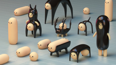
One of my favourite artists that attended Pictoplasma was Jun Seo Hahm, his work caught my attention as soon as I decided to go to Pictoplasma, mainly because his characters/creatures he creates look so simple but the 3D model makes them look so realistic with the glossy, fleshy look. These biologically inspired characters and creatures were the face of this year's Pictoplasma. The artist seems to make a lot of conceptual art and not much for commercial use.
I love his creations, I think the simplicity of them is what makes them so unique, throughout his work he is constantly finding new ways to form/combine different elements/creations to create this monstrosity of a character. His style is great, using the same type of texture but with some alterations depending on the design, the skin tone glossy look is an excellent choice, it makes them look much more organic, real and cute at the same time. What I will take forward from Jun Seo Hahm's work would be the composition and how he lays out the characters, stacking them ontop of eachother or aligning them within a grid.


I love his creations, I think the simplicity of them is what makes them so unique, throughout his work he is constantly finding new ways to form/combine different elements/creations to create this monstrosity of a character. His style is great, using the same type of texture but with some alterations depending on the design, the skin tone glossy look is an excellent choice, it makes them look much more organic, real and cute at the same time. What I will take forward from Jun Seo Hahm's work would be the composition and how he lays out the characters, stacking them ontop of eachother or aligning them within a grid.


TWICE WEEKLY REFLECTIONS - 10/5/16
Since the last reflection I havn't done any work with both of my projects, the reason being I was attending the Pictoplasma Festival in Berlin. Now the trip is over I have planned out thoroughly what will need to be done by what day, making these lists are a great way to keep a track of time and organisation. At this moment I am working on my blog and catching up with the posts I have missed throughout this week. Once that is complete I will then finish all my development for both the Derwent and Air Max projects before finalising my design any further. The next reflection will be in 24 hours to show the progress i'm making within my given time.
PICTOPLASMA - CHARACTER WALKS
PICTOPLASMA
CHARACTER WALKS
Throughout the week I was in Berlin attending the Pictoplasma Festival there were character walks all across the area, some being a close walk and others being a train journey away. Each day I spend a few hours of my spare time finding these places that show off individual artists and their work, putting stuff on display and selling artwork as well. Each character walk was different in every way, the layout and organisation of the artist's work and their designs were unique and attracted the attention of the public. Some of them didn't appeal to me as much as the others because the art style or the techniques weren't to my liking or I work in a different way. The ones I enjoyed and admired; I purchased prints of the artwork.


PICTOPLASMA - STREET ART
PICTOPLASMA
STREET ART
On the 3rd May I and a bunch of students went on a trip to Berlin to attend the Pictoplasma Festival, throughout the week I explored the city of Berlin and saw some amazing artwork. Their was so much diversity and meaning with the artwork as they all were different and incredible in their own way. Most of the street art I saw has made me want to experiment with different media, techniques and try to expand my preferred art style.
I tend to work with graffiti in my own time away from college projects but this trip has made me want to include some elements of graffiti and street art within my current projects and future ones. Not only has the artwork inspired me but the colours used in each photograph are so different from each other that they all stand out individually.


Tuesday, 26 April 2016
CHANNEL 4 ANIMATION - CINEMA 4D
Last week's session on the Mac's showed me how to create a very basic animation, this specific one was showing how Channel 4 create their animated 4 for their adverts on TV. Using Cinema 4D, we were showed the production and process of this animation while taking notes, each stage we would then repeat what we were just taught, repeating bit by bit until completion, I think this method is much better than showing the whole production and then being told to redo what was just showed as it would be hard to remember important parts from the beginning. I successfully created this animation and was allowed to add my own twist by choosing a background colour and image to use used within the animation. Once I finished it I suggested if it would be possible to add a camera to follow the movement of the elements when forming the number 4, with my own knowledge I successfully did it without asking for help by my tutor, this gave me a huge confidence booster as I realised I could do more individual stuff on Cinema 4D. I really enjoyed this tutorial/lesson as it helped me with my confidence with the program and it also broadened my horizon with what I can do with Cinema 4D.


VECTOR ILLUSTRATION - PRINTMAKING
While working with 2 projects and moving from them week by week, we had a tutorial last week to diverse away from the projects and learn something new; print making. We were showed examples of work that was created with printmaking and explained the differences with the materials, technique and process. I was very interested with this method and decided to create a design in Illustrator to then have ink transferred onto paper with the design left plain or vice versa. The illustration I created is a character from my favourite game, Destiny. The reason I chose this is because it consists of many lines, angles and the shape would look great as a vector illustration. The process was very simple and straightforward, using a stock image of the character and tracing it on illustrator with a pen tool, adding detail with linework, using both white and black to create highlights and to essentially bring a light source to the image.


Monday, 25 April 2016
DIGITAL SKILLS ACQUISITION - EVALUATION/SWOT
EVALUATION

This
module was called Digital Skills Acquisition; which required creating a model
sheet for a character that I created, alongside the model sheet I had to create
a 3D model of my created character and to successfully rig, animation and
create a successful walk cycle.
To start off, I created a brainstorm for the
theme and came to the conclusion of having my character based around the
wasteland, after a process of elimination I decided to use my strongest idea to
take forward, a character that has went rogue from his previous company of
being an assassin, living alone in the wasteland with his companion, a jackal.
I wanted to expand my style and techniques.
The idea was to have the model sheet created in the design of a wanted poster.
I started to look into multiple artists’ style, work and the process of how
they’re created to help get a sense of how I would create mine. I create each element
individually, from developing my character poses from sketches to digital then moving
onto different techniques and media to try and experiment with different
software and skills. Once I created my character I then started to work on the
poses for the jackal companion and create the expression that would be placed
onto my model sheet. With the background information and story already complete
from when I created my character it was simple to piece together all the
individual elements. Once that was complete I moved onto the 3D aspect of the
project, with my character poses complete it was much easier to create a 3D
model by using the poses as reference. With the help of group activates and
tutorials I successfully created a walk cycle and a funny rugged model to be
handed in with my 3D character model.
From
the start and throughout the project my strengths were always my artwork
skills, as well as my digital skills using programmes such as Photoshop and
Illustrator. I was very confident with this project even though my knowledge of
Cinema 4D was very little, I knew I would need a lot of assistance from my tutors
and that was a huge comfort as it helped me to learn more about Cinema 4D
quickly. What I would improve on is probably making sure I know how something
can be done before making that part of my plan/idea.
I used both InDesign and Microsoft Word to write my annotation for
my digital work, I noticed several spelling errors were made when I printed my
work out. The reason is that spellcheck is a manual option in InDesign
therefore I was unaware of any spelling errors due to not being notified on the
screen, luckily I noticed before I printed my work that there were several
mistakes and corrected them.
Setting
myself targets is a great way to help be prepared and to make sure I don’t
encounter the same mistakes, my main target that I’m setting myself is to be
more aware of time management and be sure each piece is finished before moving
onto something else, overall I enjoyed this project a lot, being good and
interesting in animation defiantly helped as well and I am looking forward to
the next project which is based on traditional drawing techniques. Overall I am
very pleased with my outcome and the work that I have produced in this project,
there are a lot of skills and techniques that I have learned throughout and
will help me a lot in future projects
that include digital illustrations.
SWOT ANALYSIS
S - Strengths; throughout this project my strengths would be the digital illustrations and sketches when creating my character. Using multiple programs as well as traditional illustration and methods, as well as adapting to new art styles.
W - Weaknesses; more towards the end of the project my weakness would be the 3D part of the project, at the time my knowledge of Cinema 4D was very minimum and I struggled on quite a few occasions when creating my 3D model of my character.
O - Opportunities; From this project and the skills that I have learned during it, I believe that my Cinema 4D knowledge has increased and has allowed me to create multiple objects/ projects in 3D in my own time outside of college.
T - Threats; During this projects there was';t many threats that I faced but the ones I did I managed to resolve them quickly with the help of my tutors, my main threat was getting worried and stuck within Cinema 4D but with the problem solving it improved and strengthened my idea as well as my confidence using this software.
TWICE WEEKLY REFLECTIONS - 25/4/16
AIR MAX PROJECT
So far with myAir Max project I have made some significant progress since the last update on my current projects/work. The latest achievements that I have made is starting my 3D model using Cinema 4D, within this project I have taken my idea and developed it thoroughly by experimenting with layout and composition to try and get the best look for my design, as well as trying to use as much 3D space as possible, creating depth and looking into the camera angles to create a less plain and flat image. At this current stage I am experimenting with textures and creating camp's to apply to my typeface and elements that surround the text, using Photoshop to create these textures.
DERWENT DRAWING PROJECT
Lately I haven't spent much time with this project, I have been more interested with the Air Max 3D design therefore for the past week I have achieved very little progress, but what I have completed since my last update is looking at artist research and using their skills, techniques, themes and styles to help influence my ideas and hopefully improve certain elements. I am yet to start my final piece but will very soon, mainly because I was still developing my idea and refining but I am confident enough to start it.
This is the progress I have made since the last update/reflection and I challenge myself to make twice as much progress for the next reflection next week and hopefully I will have much more work to show and evaluate.
Sunday, 10 April 2016
WBL WEEK 1 - NO BROW
NO BROW
Throughout all of my previous projects, NoBrow has always been an example to use to help with your idea or mentioned for techniques and reference. So using 3 examples of their work to try and improve certain aspects of my idea for my final illustration would help greatly. The first example of a No Brow artist is McBess; I have been referred to his work and seen so many examples over the duration of many projects, the example of McBess' work that I will analyse and deconstruct is this piece that is titled 'Gustave Dore - Final Cream' the reason for choosing this illustration was because of the sheer amount of detail that is shown throughout the entire page, each individual element within the design has a purpose and reason for being there, also adding more depth, story and meaning to the design.
The style of McBess' work is absolutely tremendous! Yet at the same time very unusual and peculiar. His abstract characters are mainly what he is notorious for, especially the faces of the characters, long hollow eyes and covered in tattoo's and facial hair. Within each illustration the characters seems to have a story of their own, using the elements around, the expressions and dynamic poses to explain it. The monochromatic style is used in all of his work, multiple tones of grey and black as well as using cross hatching, dotwork and linework to create depth, shading and highlights. The majority of his artwork will involve the same theme, naked women, beards and alcohol!


My final artist that has collaborated with NoBrow is Brecht Vandenbroucke, a Belgian cartoonist and illustrator that produces vast and complex paintings detailing everything from the apocalypse to the mundanities of everyday life. The reason I chose this artist was because his style adn artwork intrigued me, having already recognised his work from researching White Cube in previous projects. The work he produces has such a wide range or themes, concepts and styles; using political matters as a base and them abstract illustrations/paintings to make you think WTF?! This diversity i what inspires me the most, being able to suddenly change style and mindset when creating a piece of artwork is definitely something I would like to learn.

This would be my favourite painting that Brecht Vandenbroucke created, mainly because of the theme/story behind it as well as the quality of the painting and how well done it has been made. This cartoon art style involving a very deep, adult humor concept is definitely a favourite of mine, I'm beginning to recognise more artists who have a very similar mindset when creating cartoons. The process is defiantly acrylic paint which I prefer as if it was made digitally, having the painting still feel raw and experimental just adds a bit more thought and time in it, comparing to a clean digital painting with no mistakes.
Overall I am glad with the 3 artists that have collaborated with NoBrow and I tried to choose 3 very different artists with uniques styles; I enjoyed learning and analysing their methods and how they produce their artwork.
The style of McBess' work is absolutely tremendous! Yet at the same time very unusual and peculiar. His abstract characters are mainly what he is notorious for, especially the faces of the characters, long hollow eyes and covered in tattoo's and facial hair. Within each illustration the characters seems to have a story of their own, using the elements around, the expressions and dynamic poses to explain it. The monochromatic style is used in all of his work, multiple tones of grey and black as well as using cross hatching, dotwork and linework to create depth, shading and highlights. The majority of his artwork will involve the same theme, naked women, beards and alcohol!

The second artist that works alongside or is apart of NoBrow is Ben Newman, I have researched this artist on multiple occasions, each time looking at his work and techniques from alternative angles/perspectives. The example of work created by Ben Newman that I will annotate and analyse is an illustration called 'Monster Squad' which was an illustration that was first used in NoBrow Issue 5 and then released as a wrapping paper designs available from NoBrow.
The reason I chose Ben Newman is because of how much his artwork and how he approaches his designs inspire me. The composition and layout of this illustration is much different to the previous illustration created by McBess, because it is a surface pattern made up of multiple faces of different characters that are repeated. The layout is using a grid to organise the individual elements; 5 columns by 4 rows allows each image to have a reasonable amount of space between, making each design not too big or small, allowing all the detail to remain visible. The techniques and production of Ben Newman's work interests me; I would say this illustration was created digitally using geometric and simple shapes to create each character.

My final artist that has collaborated with NoBrow is Brecht Vandenbroucke, a Belgian cartoonist and illustrator that produces vast and complex paintings detailing everything from the apocalypse to the mundanities of everyday life. The reason I chose this artist was because his style adn artwork intrigued me, having already recognised his work from researching White Cube in previous projects. The work he produces has such a wide range or themes, concepts and styles; using political matters as a base and them abstract illustrations/paintings to make you think WTF?! This diversity i what inspires me the most, being able to suddenly change style and mindset when creating a piece of artwork is definitely something I would like to learn.

This would be my favourite painting that Brecht Vandenbroucke created, mainly because of the theme/story behind it as well as the quality of the painting and how well done it has been made. This cartoon art style involving a very deep, adult humor concept is definitely a favourite of mine, I'm beginning to recognise more artists who have a very similar mindset when creating cartoons. The process is defiantly acrylic paint which I prefer as if it was made digitally, having the painting still feel raw and experimental just adds a bit more thought and time in it, comparing to a clean digital painting with no mistakes.
Overall I am glad with the 3 artists that have collaborated with NoBrow and I tried to choose 3 very different artists with uniques styles; I enjoyed learning and analysing their methods and how they produce their artwork.
Wednesday, 6 April 2016
GRAFFITI SUPPLIES - BOMBING SCIENCE
BOMBING SCIENCE ORDER
Yesterday I received a package that I had purchased from www.bombingscience.com. The order contained multiple markers that I will review individually. Starting with the ones that attracted my attention first is the 'Molotow Chalk Pump Marker' this consists of a 15mm chiselled tip and comes in a variety of bright colours, I chose both neon green and orange, I chose both to see the comparison between the two, comparing the colours how well they work with each other despite being the same brand and model of markers.
Starting off with the aesthetics and how to use; the pen looks great! It's very obvious to tell what colour you have selected/bought and it distinctly shows the size of the tip. I also has straight forward instructions of how to use; by priming and pumping the pen first, also indicates how much it should be filled and shows exactly how much paint (well actually it is 'water-based chalk ink' but for now we will just say paint) is left in the pen. As far as performance goes, this has to be by far my favourite paint marker I have purchased; the sheer size allows to cover large areas with minimum effort. The strokes are smooth and don't drip after applied to any surface, whether it's paper, canvas, metal, glass, wood or a chalk board. This pen applies a fair layer of 'paint' that can be removed easily from smooth and non-absorbent surfaces. From my experiments with the marker I only had to use one stroke to cover an area due to how highly opaque the marker is.


Another marker that I purchased from Bombing Science was another Molotow, but from another series. There wasn't anything special about this compared to the chalk like ink that could be removed easily, this marker was a high quality permanent paint marker with a 15mm chiselled tip. Along with this series there are multiple markers that are in a variety of sizes; from the 127HS which has a 2mm tip, to a 4 or 8mm marker.
This specific 420PP is chrome gold, the reason I chose this colour is because I have used a ton of Molotow markers but never a metallic or chrome colour and so far it is great, the flow of the paint and the opacity is different compared to the normal or neon colours but the one fault in the paint would be it is thinner and showing more marks from the chiselled tip and the direction of the stroke, this is only a minor example but doesn't change my overall judgement of these markers and to conclude that Molotow create some excellent products, all of which has their own unique adaptation that helps to sell that specific series.


Apart from a selection of Molotow products, I purchased a On The Run 'Calligraffiti' paint marker, again, quite similar to the previous products but this has a 200mm chiselled tip, this pump action marker has a flow control valve and uses alcohol based paint so make sure the area is well ventilate when using this marker. This specific marker is the .060 model, different to the other models such as the .084 and the .070. Along with my purchases I got a FREE Markal B Paintstik Marker, I found this very unusual because of how its made but I am having a lot of fun with this, the Markel B has the durability of paint and the convenience of a crayon, meaning each stroke creates an outer skin to protect it from drying out, with it being free I think this is an excellent product.


All these products that I have reviewed are avalieble at www.bombingscience.com along with a ton of awesome stuff; from markers, stickers, spray paint to clothing! This site has it all, not to mention their great postage/shipping. As I live in the UK I did expect to wait a while for my parcel to be delivered but I was surprised when I came home and it was delivered within the space of a week! To keep their audience interested in their products they have constant updates, sales and newsletters to showcase their latest stock along with free items you can select when ordering from the website including stickers, books, caps and markers just like my 'Markal B Paintstik'.
Tuesday, 5 April 2016
WBL TASK 1 - WRAP MAGAZINE
WRAP MAGAZINE

The first example that I found on Wrap Magazines instagram is a design created by Chris Silas Neal, I found it very hard finding 3 examples that I could analysis, compare and use as inspiration to my own work as the majority of designs were digitally created or incorporated digital elements. After a quick browse through a variety of their work I know this style and production methods for these designs are not what I am looking for. But by deconstructing them
The style of this design is unusual, a basic painting without any linework, minimal detail and bold colours, this reminds me of pop art and a very cartoon theme. But compared to my final illustration and the requirements of the brief, this design doesn't match any of them therefore this specific design won't inspire or help me with the use of style or technique. I am also not sure whether if this piece of artwork was for commercial work or personal and that is because I can't make out a meaning or story behind this design.

The reason I chose this piece is because I was interested in the process, it looks like the linework was drawn traditionally by hand and than scanned into a program such as Photoshop where the colour was added. I use this process often but as this project requires me to only use pencils I don't find this image or anything that has involved digital elements helpful.

The final example of artwork that was chosen fro Wrap Magazines instagram is this illustration that was created specifically for a children's book, created by Marc Martin. I like this design a lot more than the previous two or any others that are posted on the instagram, mainly because each element within this illustration was created individually and painted traditionally, once each design was finished they were arranged and organised together digitally. Also with this being part of a page in a book, there is a story behind each image as it is telling a story, this makes it much more reachable to an audience as they could understand and relate to a story compared to a contemporary piece that was made for fun. Also each image will have a very specific age group or audience depending on what book itself so I would like my illustration to also have a meaning within the visuals and have it be allocated towards a certain audience.
Subscribe to:
Comments (Atom)